Of all the things people argue about!
Ultimately they both do the same thing – take an existing workflow that I know, and add an abstraction layer that gives us tons of new options. Interactivity within the container's shell is powerful, but there needs to be user experience changes in order to make that really easy to use and productive. Hence, distrobox and toolbox are fixing the symptom. The actual problem is to not use duct tape, the terminal needs to talk to the container runtime directly. We even have an entire spec hoping someone will make this. And think we're getting closer.
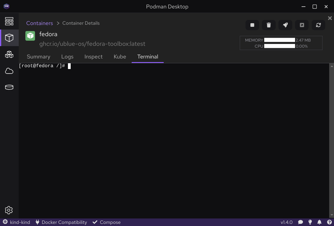
This solves two problems. It removes the "Should toolbox add this feature that everyone wants" discussion because that conversation isn't going to go anywhere. And the second is user experience. The goal is to provide a CLI for the user right? Here's one.

Now before you linux nerds get too angry, of course the UI should be slimmed down for the "default terminal" experience, this just happens to be what they have right now for the container screen. Pretend we can make the UI make sense for us.
It is a nice UX layer that is clearly missing in both toolbox and distrobox though! The ability to visually add the context of the thing I am going into. It's like the HUD in our terminal video game.
It's one of the things people love about WSL, that little icon in the terminal UI that has the logo of the container you're in. Plus as a former Ubuntu contributor, it's nice to see that logo because in the real world that thing is everywhere, lol.
Why it has to talk to podman
Rob McQueen and I once called Flatpak the "missing desktop API" that Linux needs. The container runtime handles the other part. They should just talk directly. Have the client apps decide what features to add and expose based on UX, show as little or as many options as you want.
This is 100% moving the problem, not solving it! But I think we can remove the duct tape now. The real problems people have when using toolbox and distrobox is that even as an expert user it's still juuuuust enough friction to be annoying. I think this would help fix that because there's an existing GUI for the thing, it just needs to be adapted to our needs!
You know what would be cool?
I think it'd be neat if someone where to prototype out what this would look like. If you need a terminal there's a good chance you're going to be using Podman Desktop for all the other stuff it does.
Basically, what would the existing terminal section look like if it was able to be run standalone and then have the UX represent the default terminal we want for our systems.
And then the best part I like about this idea is that the rest of Podman Desktop is still there. I think this solves a problem for people who are not used to running Linux this way. Otherwise they're going to keep trying to apt-get install nginx instead of running an nginx container, as is intended, heh.
But, either way if it gets more people talking about it then that's a net win.